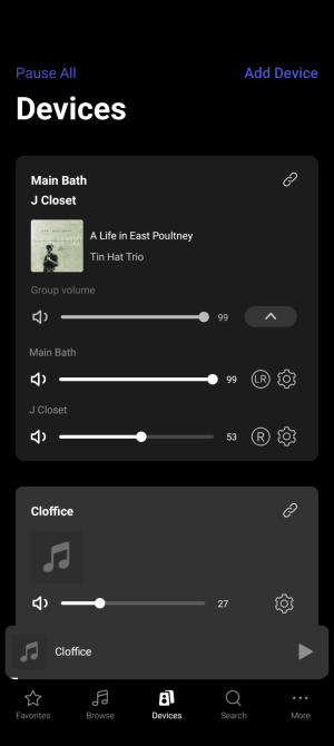
When I move from this screen:

to this screen to select some music (which is a bad UX, but I have a separate feature request for that),

having another group at the top of the scroll list – other than the room I was in – is confusing. I lose context of which group is being controlled.
In addition, the gray shading is a bit too subtle and non obvious. I don't want to get in the suggestion game, but there are plenty of approaches that I'm sure would work.

to this screen to select some music (which is a bad UX, but I have a separate feature request for that),

having another group at the top of the scroll list – other than the room I was in – is confusing. I lose context of which group is being controlled.
In addition, the gray shading is a bit too subtle and non obvious. I don't want to get in the suggestion game, but there are plenty of approaches that I'm sure would work.
Upvote
0
