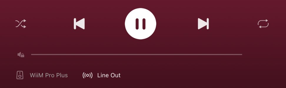
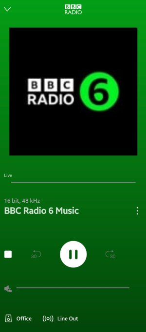
I think the app's player GUI looks a bit messy still at the bottom, even more so with the volume level set to "fixed". Instead of showing the grayed-out volume bar with the text through it, maybe just show a small icon indicating volume control has been disabled or just hide the bar altogether. Also I think the playlist button could be moved down to sit next to the other buttons in the bottom row. ")