
Interface
Typically here
Why display the volume level so prominently... when a fixed level of 100%?
What interet?
But also a bit silly...:
announcing and offering a "living room" menu, etc., when I'm not using multiple devices...??
This space could be used, for example, as a shortcut to favorites or entries, etc...?
A slightly more "intelligent" approach to this essential page?
allowing us to simplify or enrich it as we see fit?
;-)
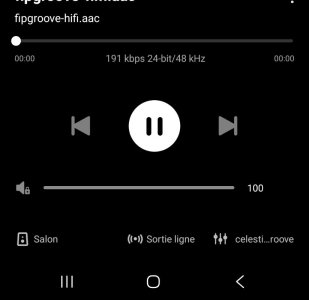
Attachments
Last edited:


 )
)