Screen customization or options

Another apparent bug with the display. When grouping the Ultra with a Mini the screen on the Ultra changed from Album Art to the fake EQ display, and I can't change it. Checking the firmware version I'm still one version behind from the latest, so hoping this will be addressed next update. If it was an actual EQ display (versus a random animation), I'd leave it on, but for now the screen will remain off until this gets fixed.
 
Last edited:
Another apparent bug with the display. When grouping the Ultra with a Mini the screen on the Ultra changed from Album Art to the fake EQ display, and I can't change it. Checking the firmware version I'm still one version behind from the latest, so hoping this will be addressed next update. If it was an actual EQ display (versus a random animation), I'd leave it on, but for now the screen will remain off until this gets fixed.
Which input? Is the Ultra the host of the WiiM group in this case? Which input is shown on the Ultra's touchscreen in this case?
 
The screen on the ultra says "Group with Wiim Mini..." I tried starting the stream on the Ultra then adding the Mini and that restored the album art display. So that's a pretty good work around. Thank you!
 
The screen on the ultra says "Group with Wiim Mini..." I tried starting the stream on the Ultra then adding the Mini and that restored the album art display. So that's a pretty good work around. Thank you!
Yeah, it does make a difference.
 
How does the display of the Wiim Ultra compare to others like for example NAD C700? Does it come near quality wise and is the display just as sharp?
 
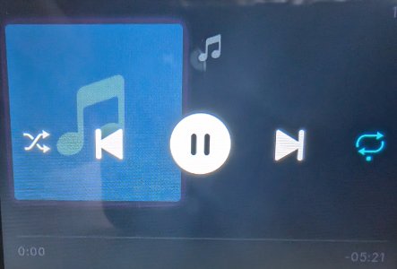
I would like more capability from the touchscreen. Perhaps on the play control screen (see below) there could be three icons across the top that would launch sub-menus: one for source selection, one for output selection and one for presets 1-10.
 

Attachments

  • temp.jpg
    temp.jpg
    869.4 KB · Views: 8
I would like more capability from the touchscreen. Perhaps on the play control screen (see below) there could be three icons across the top that would launch sub-menus: one for source selection, one for output selection and one for presets 1-10.
Too complicated. Just give me quick access to the home screen from everywhere. :)
 
How does the display of the Wiim Ultra compare to others like for example NAD C700? Does it come near quality wise and is the display just as sharp?
I have a c700 and m10v along with an ultra. They are all lowish resolution when compared to a modern phone. The refresh rate of the Nads are higher. It may just be the difference of processing power. The nads displays are just more responsive over all. They should be at their cost. The CA evos have the best displays in my opinion.
 
More options in screen choices would be great, personally I find the display text from my listening position too small, maybe the first screen choice could have a larger text size below the album art but obviously at the sacrifice of the quality and bit rate, or maybe they could be moved to the side?
Also I like that the screen can be turned off when not in use or the clock can be displayed, i would like to see a simpler clock with smaller font and just white.
Obviously the screen is small so limited but more options would be great for individual use cases.
 
Back
Top