
Hi, I really like the WIIM app, it is easy to use and get updated regularly. However I have a disappointment with one of the recent upgrade, where they changed the EQ screen. In that case, it seems they fixed something that was not broken and made it less useful.
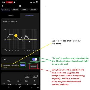
All saved EQ used to be on the same screen as current active EQ, it was easy to understand and convenient if you want to go between saved EQ settings for testing. With the last update, they split this on two screen and added info that is pretty useless and clutter the screen.
End result is that this makes the new version less user friendly as you keep having to navigate between screens and add unneeded complexity.
See attached image to see what I mean
* Am I the only one who wish they just brought it back as it used to be? *
") I guess we just use it differently.
I guess we just use it differently.

