
The PEQ feature in WiiM's products has developed very well over time and definitely turned into an extremely powerful tool. One great feature is the support of fully flexible filter Q values, not only for peak filters, but also for high shelf and low shelf filters.
Unfortunately, the effects of different Q values are currently displayed for peak filters, only.
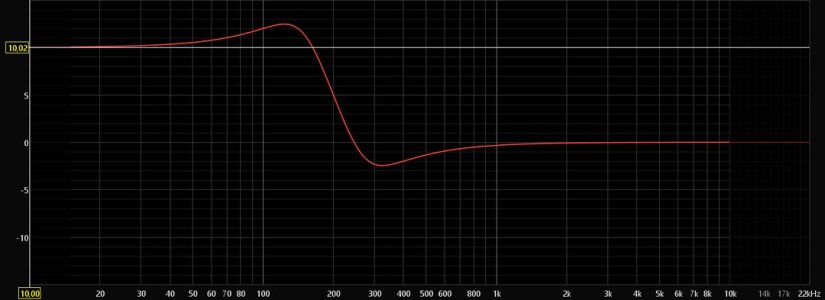
For example, here are the graphs for a 200 Hz +10 dB PK filter with either Q=1.5 or Q=0.15. The difference is obvious and understood very intuitively.


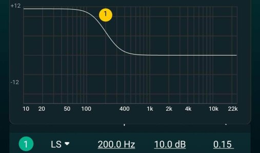
In contrast, the graphs for a 200 Hz +10 dB LS filter currently look exactly the same for Q=1.5 and Q=0.15. But this is not what really happens.


My request is to visually display the effect of different Q values for shelving filters as well.
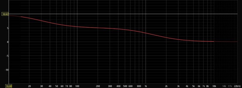
For the LS filters shown above this should look somewhat like this:


Although I am well aware of the fact that precise measurements should ideally be combined with listening experience, this would be a more than welcome improvement.
Please upvote if you agree, please comment if you don't.
Unfortunately, the effects of different Q values are currently displayed for peak filters, only.
For example, here are the graphs for a 200 Hz +10 dB PK filter with either Q=1.5 or Q=0.15. The difference is obvious and understood very intuitively.
In contrast, the graphs for a 200 Hz +10 dB LS filter currently look exactly the same for Q=1.5 and Q=0.15. But this is not what really happens.
My request is to visually display the effect of different Q values for shelving filters as well.
For the LS filters shown above this should look somewhat like this:
Although I am well aware of the fact that precise measurements should ideally be combined with listening experience, this would be a more than welcome improvement.
Please upvote if you agree, please comment if you don't.
Attachments

Last edited:
Upvote
30