WiiM Home Apple TV v1.2 Update – Aug 3, 2025

Please review the Apple TV app update release notes below. If you encounter any issues, feel free to reach out to us.

Apple TV App Release Version
v1.2

* Note: The app version is displayed as 1.005 in the application. We will unify the version number shown in the app and in the app store.

What's New:

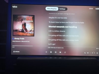
1. Clock Display: Add time display at the top right corner.
2. Lyrics Display: Optimize the display of lyrics for better readability.
3. Queue Page Enhancement: Add total tracks count to the Queue page.
4. UI Improvements: Optimize text, color, and playback animation display.
 
Last edited:
My Wiim app version on my Apple TV is 1.005. It does not update even after deleting and reinstalling.
Hi @TimWii ,

Sorry for our mistake. The app version is displayed as 1.005 in the application. We will unify the version number shown in the app and in the app store.
 
Hi @TimWii ,

Sorry for our mistake. The app version is displayed as 1.005 in the application. We will unify the version number shown in the app and in the app store.
With all the modifications you have introduced so far, the app is close-to-perfect now, at least for my use cases. Many thanks for your hard work on this and especially for listening to the users - great job! If there was just one thing you should focus your efforts on, for me this would be an addition of "Presets Screen" section (sitting between Now Playing and Settings in top bar?) where you could SELECT (not manage) your presets created otherwise (e.g. in the phone app). This, especially when combined with increased number of presets available (I think you have mentioned 32 in one of your posts?) would convert the app into fully-fledged playback management solution and make this even more usable. Presets could have some small icons and text, so you could try to squeeze them into 4x8 grid visible on single screen (or if not possible - scrollable list?). Do you think you could consider this so it could launch together with those increased number of presets you are working on?
 
With all the modifications you have introduced so far, the app is close-to-perfect now, at least for my use cases. Many thanks for your hard work on this and especially for listening to the users - great job! If there was just one thing you should focus your efforts on, for me this would be an addition of "Presets Screen" section (sitting between Now Playing and Settings in top bar?) where you could SELECT (not manage) your presets created otherwise (e.g. in the phone app). This, especially when combined with increased number of presets available (I think you have mentioned 32 in one of your posts?) would convert the app into fully-fledged playback management solution and make this even more usable. Presets could have some small icons and text, so you could try to squeeze them into 4x8 grid visible on single screen (or if not possible - scrollable list?). Do you think you could consider this so it could launch together with those increased number of presets you are working on?
Hi @DariuszP ,

Support for Presets, Input/Output switching, and EQ selection is coming soon to the TV app—stay tuned!
 
4. UI Improvements: Optimize text, color, and playback animation display.
How can I remove the 3 jumping bars? They are so annoying!

I don't know why I have to look at this unnecessary animation. Someone @WiiM Team must like them. I don't.

And that is actually also true for the WiiM Home App. The playing entry is highlighted. Nothing else needed.
 
Last edited:
Hello. I have the problem that the lyrics are not synchronized with the music. I have an Apple TV 4K (1st generation) and a WiiM Pro. The music is coming from Qobuz. The lyrics are slightly delayed. Is there a way to adjust this?
 
How can I remove the 3 jumping bars? They are so annoying!

I don't know why I have to look at this unnecessary animation. Someone @WiiM Team must like them. I don't.

And that is actually also true for the WiiM Home App. The playing entry is highlighted. Nothing else needed.
Disagree. The bars are a useful indicator for devices in other rooms.
 
Disagree. The bars are a useful indicator for devices in other rooms.
So you can't hear if something is playing? Or can't see the selection highlight?

On the WiiM Home App it's kinda ok, as I don't look at it all the time. On the big screen it's not needed.

Or is it just because you always disagree with me :unsure:
 
How can I remove the 3 jumping bars? They are so annoying!

I don't know why I have to look at this unnecessary animation. Someone @WiiM Team must like them. I don't.

And that is actually also true for the WiiM Home App. The playing entry is highlighted. Nothing else needed.
I find this pretty useful and for me it is not at all annoying (it occupies probably much less than 1% of the Now Playing screen?). And it is useful to see if something is actually playing (but is e.g. muted or playing to different output) or not (e.g. playback is paused). And it is also quite pretty:).
 
are there any pictures how the layout and design looks like ? Want to buy the Apple TV 4K 2025/2026 (when it finally comes out) and connect it via hdmi to the Wiim Ultra
 
awesome! That was fast! Thank you :-)
Looks nice! Did you also connect via hdmi arc ?
I´m also working with iOS 26 and MacOS 26 and really happy with - big step forward and nice to see tvOS 26.
 
awesome! That was fast! Thank you :-)
Looks nice! Did you also connect via hdmi arc ?
I´m also working with iOS 26 and MacOS 26 and really happy with - big step forward and nice to see tvOS 26.
No hdmi arc involved it just connects as a remote to my ultra
 
Back
Top