Please review the app update release notes below. If you encounter any issues, feel free to reach out to us.
iOS Release Version
v3.0.0
What's New:
1. Dark Theme with Accent Purple: Enjoy a sleek Dark Theme with purple accents for improved focus and readability.
2. “More” Tab Update: Renamed the “Settings” tab to “More” for easier navigation and to reduce confusion with device settings.
3. Persistent Group Support: Quick multi-room audio setup and synchronization for seamless group playback (available in the next firmware update).
4. Smart Preset (Beta): Customize preset buttons for OUTPUT, VOLUME, EQ, URL, and SHUFFLE settings (coming in the next beta firmware).
5. Plex Enhancements: New support for Plex Presets, Recently Played, Search, and artist-specific track display.
6. Room Correction Improvements: Save and access EQ settings from Room Correction, with an option to disable them directly from the EQ page.
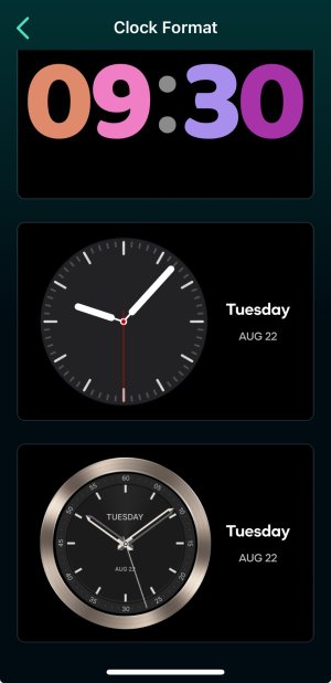
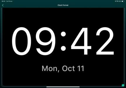
7. Two Analog Clock Faces for WiiM Ultra: Choose from two new clock faces for the WiiM Ultra (available in the next firmware update).
8. USB Disk Ejection: Manual USB ejection now supported (available in the next firmware update).
Bug Fixes:
1. General Performance Enhancements: Various performance improvements and bug fixes for a more stable app experience.
Android Release Version (Currently under Google Play Review)
v3.0.0
What's New:
1. Dark Theme with Accent Purple: Enjoy a sleek Dark Theme with purple accents for improved focus and readability.
2. “More” Tab Update: Renamed the “Settings” tab to “More” for easier navigation and to reduce confusion with device settings.
3. Persistent Group Support: Quick multi-room audio setup and synchronization for seamless group playback (available in the next firmware update).
4. Smart Preset (Beta): Customize preset buttons for OUTPUT, VOLUME, EQ, URL, and SHUFFLE settings (coming in the next beta firmware).
5. Plex Enhancements: New support for Plex Presets, Recently Played, Search, and artist-specific track display.
6. Room Correction Improvements: Save and access EQ settings from Room Correction, with an option to disable them directly from the EQ page.
7. Two Analog Clock Faces for WiiM Ultra: Choose from two new clock faces for the WiiM Ultra (available in the next firmware update).
8. USB Disk Ejection: Manual USB ejection now supported (available in the next firmware update).
9. Amazon Music Update: Enhanced responsiveness when accessing Artist or Album details in Track More Options.
Bug Fixes:
1. Artwork Display Issue: Resolved an artwork display problem for smoother visual consistency.
2. General Performance Enhancements: Various performance improvements and bug fixes for a more stable app experience.
Last edited:


