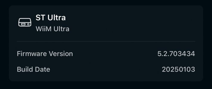
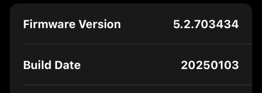
WiiM Ultra Firmware v5.2.703434 - Jan 3, 2025

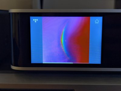
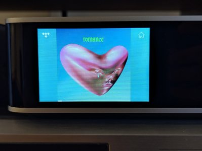
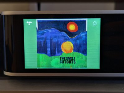
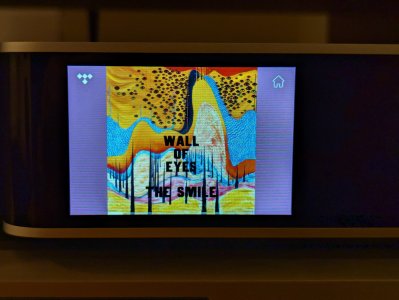
Seems like something's been changed in the full-screen album art view, but not for the better.

It used to be a gradient or blurred out version of the album art, stretching out to the sides. Now it's just a plain color, which to me looks to be mixed with a shade of gray... It looks pretty dull.

I preferred the gradient/blurred out effect, but I think the option to have plain black sides would still look the best.
 

Attachments

  • PXL_20250103_152227007.jpg
    PXL_20250103_152227007.jpg
    1.1 MB · Views: 22
  • PXL_20250103_152327857.MP.jpg
    PXL_20250103_152327857.MP.jpg
    1.5 MB · Views: 22
  • PXL_20250103_152345554.jpg
    PXL_20250103_152345554.jpg
    1.4 MB · Views: 25
Seems like something's been changed in the full-screen album art view, but not for the better.

It used to be a gradient or blurred out version of the album art, stretching out to the sides. Now it's just a plain color, which to me looks to be mixed with a shade of gray... It looks pretty dull.

I preferred the gradient/blurred out effect, but I think the option to have plain black sides would still look the best.
I didn't get the update yet. Based on your photos I like this better than the blurred out sides, but I agree that maybe the plain black would be the way to go.
 
Seems like something's been changed in the full-screen album art view, but not for the better.

It used to be a gradient or blurred out version of the album art, stretching out to the sides. Now it's just a plain color, which to me looks to be mixed with a shade of gray... It looks pretty dull.

I preferred the gradient/blurred out effect, but I think the option to have plain black sides would still look the best.
Looks like they now follow the WiiM Home App design.

It do however not fit for a screen like the Ultra device and I would for sure prefer it to be just black or as before.
 
V5.2.703434 downloaded on Dec 30 came down again. As @onlyoneme said, it appears that the issues was found and fixed. The first post in this thread was also just updated, with the update date changed to January 3.
The version number was also changed from 5.2.640239 to 5.2.703434.
 
I didn't get the update yet. Based on your photos I like this better than the blurred out sides, but I agree that maybe the plain black would be the way to go.
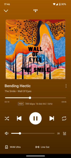
Here's another example where I don't really get why it chose this color (some kind of pink/purple). Looking rather ugly 🥲

In the WiiM Home app it's a different color - orange, which is also more present in the artwork.
 

Attachments

  • PXL_20250103_163748476.jpg
    PXL_20250103_163748476.jpg
    1.4 MB · Views: 20
  • Screenshot_20250103-174605.png
    Screenshot_20250103-174605.png
    1.4 MB · Views: 17
Last edited:
I got the update this afternoon in the UK, it borked the USB output. I did a power cord out reset, that fixed it. Spent 5 minutes fannying about with my amp and preamp before trying that though 😁 And I agree that the album art borders should be black on full screen.
 
I want my sides blurred, as it is now. They should let you make a choice (if you prefer black or colour or blurred) instead of forcing this backward change on us.
...in addition, it would even be a good idea to be able to use a blur or a black background in the WHA as well. The partially generated colors, especially in dark environments, sometimes dazzle your eyes so much that you have to throw your tablet into the corner in horror.
 
...in addition, it would even be a good idea to be able to use a blur or a black background in the WHA as well. The partially generated colors, especially in dark environments, sometimes dazzle your eyes so much that you have to throw your tablet into the corner in horror.
It is strange that @WiiM Team make these random changes without a good reason and no feeling for UI design.
 
I got an update, but not for the firmware, just the WiiM app update to 3.0.9
The new thing is you can check your device's firmware update from the app menu, and no, still no FW update for me here.
 
Seems like something's been changed in the full-screen album art view, but not for the better.

It used to be a gradient or blurred out version of the album art, stretching out to the sides. Now it's just a plain color, which to me looks to be mixed with a shade of gray... It looks pretty dull.

I preferred the gradient/blurred out effect, but I think the option to have plain black sides would still look the best.
I agree. I have also requested black side bars in a feature request somewhere else in this forums :-)
 
There’s people who don’t use the UV meter screen? Woah. Hahaha

I preferred the blurred sides, but black would be good too. Something to make the album art pop so it’s more visible. The color matched border makes it look a little busy IMO.
 
Back
Top