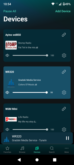
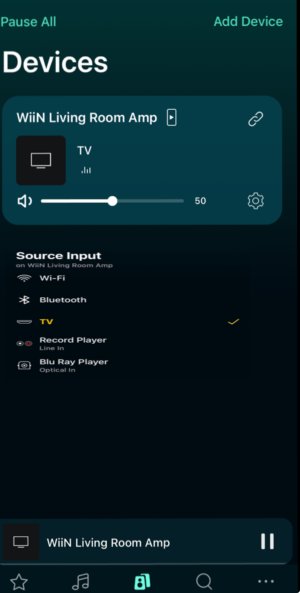
Please review the app update release notes below. If you encounter any issues, feel free to reach out to us.
iOS Release Version
v3.0.1
What's New:
1. SoundMachine Enhancements: Added Preset and Alarm support in SoundMachine (available with the next firmware update).
2. Multi-Room Low Latency Mode (Beta): Introduced Multi-Room Low Latency Mode to reduce playback latency for multiroom audio when using Line In, Optical In, Phono In, TV, and Bluetooth inputs (requires upcoming beta firmware).
3. Room Correction Enhancement: Improved the algorithm to detect microphone recording issues and avoid incorrect detections.
4. Replay Gain for TIDAL & Qobuz: Added Replay Gain support for an enhanced listening experience (requires upcoming firmware).
5. USB Media Library Access: Access USB Media Library directly from the Home Music Share page.
6. UI Improvements: Improved artist text, name display, and background color for better readability on the Now Playing page.
Bug Fixes:
1. Smart Preset Fixes (Beta): Fixed an issue where USB Out changes in Smart Preset were not applied.
2. General Fixes: Various performance improvements and bug fixes.
Android Release Version
v3.0.1
What's New:
1. SoundMachine Enhancements: Added Preset and Alarm support in SoundMachine (available with the next firmware update).
2. Multi-Room Low Latency Mode (Beta): Introduced Multi-Room Low Latency Mode to reduce playback latency for multiroom audio when using Line In, Optical In, Phono In, TV, and Bluetooth inputs (requires upcoming beta firmware).
3. Room Correction Enhancement: Improved the algorithm to detect microphone recording issues and avoid incorrect detections.
4. Replay Gain for TIDAL & Qobuz: Added Replay Gain support for an enhanced listening experience (requires upcoming firmware).
5. USB Media Library Access: Access USB Media Library directly from the Home Music Share page.
6. UI Improvements: Improved artist text, name display, and background color for better readability on the Now Playing page.
Bug Fixes:
1. Smart Preset Fixes (Beta): Fixed an issue where USB Out changes in Smart Preset were not applied.
2. Device Name Fix: Correctly displays the device name after changes.
3. USB Index Fix: Resolved incomplete scans of USB music files.
4. CPU and Memory Optimization: Reduced CPU and memory usage for smoother performance.
5. General Fixes: Various performance improvements and bug fixes.


